
Connector Configuration
Connectors allow users to integrate with other applications and data systems. This feature is critical to get users to adopt and engage with the product. After sign up, connectors are used to bring data onto the platform in order to use the product’s monitoring and management tools.
Industry
Goal
Team
Enterprise SaaS
Take a core product feature with an outdated design and improve the user experience.
1 Product Designer, 1 Product Manager, 1 Front End Developer, 1 Engineering Manager
Existing Design (Before)


Pain points
Connector configurations can vary from ~20 inputs to over 100 configuration settings. In the current design the input fields are stacked horizontally and vertically with no space between. This resulted labels and values getting cut off, making it difficult for the user to read. It was unclear which fields had errors and how to address the issues.
At this time, our users preferred to use the Command Line Interface (CLI) to add connectors. Having the deemed the CLI experience acceptable, the company decided not to prioritize the feature.
Version 01: Programmatic User Interface
User story
I am a developer working for Hammer industries. I am trying out Confluent to see if the product meets our need for real time data. I need to access data, spread across several different data warehouses, in Confluent platform to be processed. The processed data would need to be exported over to other systems for metrics and monitoring.
Goals
Optimize connector configuration for the new cloud product.
Design one interface that could unify the user experience of our on prem and cloud products, reducing the time and effort required to add new connectors to the platform.
Improve legibility, ease of use, and addressing errors.
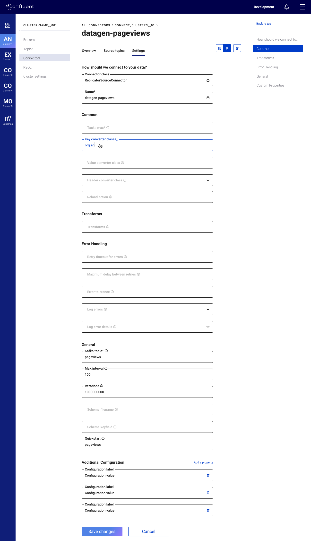
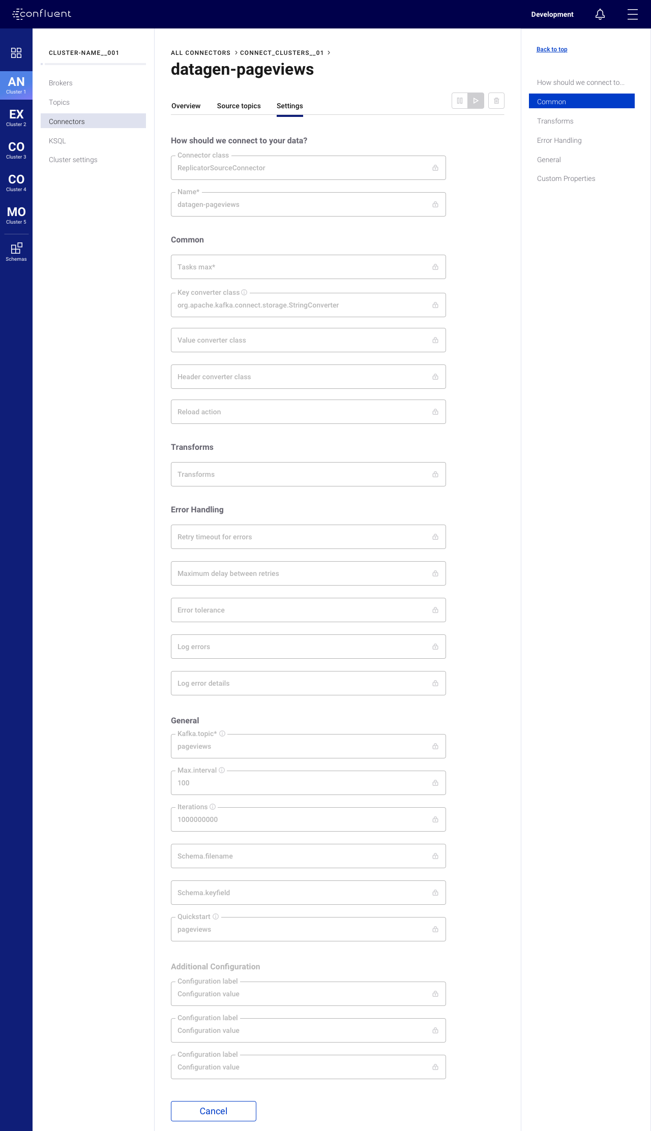
Design
In order to create a framework that could be used by all current and future connectors for both the on premises and cloud experience, the first issue that was addressed were the input fields. This gave birth to the foundation for the the company’s first design system, based on Google’s Material design. The input fields were updated to account for a variety of different states that could provide visual indication or feedback for the user. The grid system limited the widths of the fields, creating breakpoints that prevented labels and values from getting cutoff. Only full width inputs were used for connect configuration, but the system was implemented across the entire product, including an underlying 8px grid system.


On prem experience
The programmatic UI for the on premises product allows for maximum customization resulting in long list of inputs. On the right side, anchor links are provided to allow users to easily navigate the form of up to 200 configurations. In this implementation, customers have to negotiate costs prior to deploying the product so cost is not a concern during configuration.
A browse connectors page was added so that a user could select and add a connector in the product. Previously a connector had to be downloaded and installed using the CLI.
Cloud experience
The experience in cloud is different as there are more limitations since the service is fully managed. The new design featured a more guided process aimed at reducing the cognitive load on the user, spreading out configurations across a few pages.
On the right side, a configuration summary along with estimated cost is shown on the right side of the programmatic UI in cloud because the user has to agree to a cost at launch. Users can ramp up or down parts of their service at any point which would impact the cost.


The Programmatic UI enabled the company to invest in a 100 connector program. Our internal team, combined with hired contractors around the world, added 100+ connectors to the library in 2019.
Version 02: Self-Service Provisioning UI
This was the first design-led project at the Company. A design was shared, reviewed, evangelized, and ultimately funding/resourcing was arranged for this project to be shipped.
HEART Metrics
While the Connect team was occupied with the initiative to add 100 connectors to the library, updates to the GUI were not a priority. During this time, a workshop was organized with stakeholders from design, product management, engineering, and data science. The goal was to establish a direction for future design updates to the GUI and user experience for connector configuration. The HEART Framework, created by the product team at Google, was used to get alignment across teams.
Happiness
Increased satisfaction with Connectors
Engagement
For people to use our connectors for critical tasks
Adoption
Add more connectors (Not a core focus for design)
Retention
For customers to continue using connectors
Task Success
For people to set up connectors in one session
Design
The strategy was to maximize impact by focusing the parts of configuration flow that apply to all connectors. The new design was based on four key improvements:
The browse page, where a user could select which connector they wanted to launch, offered no information about what each connector actually did or what support was offered. Expectations could be managed by improving this page, before the configuration flow is initiated.
Configurations that applied to all connectors were separated from connector specific inputs. This was necessary to maintain a consistent user experience across the majority of the configuration process. Future iterations could address individual connectors and be prioritized by popularity.
Required fields would be highlighted and advanced configurations would be hidden. This reduces the cognitive load, allowing newer users to focus on the key inputs. More technical users could still access any number of additional configurations for further customization.
Default values would be applied whenever applicable. New users should be able to successfully launch a connector with minimal effort. Default values allow users to skip parts of the configurations and also provide an example of correct values.
This approach resulted in a flow that spanned several pages and enabled us to track user behavior per page. The Growth team also took particular interest in running a series of A/B tests on different parts of the configuration flow and continue to do so today.


Performance Metrics


Retrospective
Always account for knowledge sharing. After engineering began on implementation of this design, the team experienced a reorganization in which all engineering efforts were reallocated to team members overseas. There were several delays while new team members had to ramp up on the product area and the work that was done.